Showing posts with label distortion. Show all posts

Saturday, May 3, 2025

Wol I thought you was part of the camouflage scheme

Above Charles Grave, cartoon from Punch, January 23, 1918: Docker (to Jack, who has been silently regarding him). “Wot yer starin’ at, Nosey?” Jack: “You shouldn’t have spoke, mate. I thought you was part of the cammyflage scheme.”

•••

CAP’N CALEB’S CAMOUFLAGE in Punch, June 12, 1918, p. 374.

He was an object of interest in the bar of “The Sloop,” for he was one of the crew of a vessel which had been torpedoed off the headland during the night, and he had been landed with other survivors at the fishing village that morning.

“Yes, it gives yer a shock being torpedoed,” he said in answer to a question; “but I'm orlright now, and I'll be better when I've 'ad some more beer. I ain't lost my thirst, not that you could notice, though I was blown up in the air when the torpedo 'it us, and came down in the sea.”

The questioner took the hint and ordered another pint of beer, which the shipwrecked mariner drank deliberately with the air of a connoisseur.

“It ain't bad beer that, boss," he remarked politely to the landlord; "but I reckon a man would get waterlogged before 'e could get drunk on it.”

The landlord smiled and discreetly turned the oonversation back to the subject of the submarine menace.

“No, I ain't afraid o’ submarines, but my missus is;” said the mariner; ”that's why I'm 'ere. I’ve been torpedoed twice this year, and my missus is to blame. But it serves me right for listening to ‘er and leavin’ the old Saucy Anne.”

“It all comes o’ this cammyflage ideas,” he went on with a heavy sigh. "If it ‘adn't been for old Cap'n Caleb's a-cammyflagin‘ the Saucy Anne the missus'd never've got the wind up about submarines and I'd never've been torpedoed. And I wouldn't be standin’ ‘ere now with an empty glass in me ‘and."

It was the landlord who took the hint this time end hastened to remedy the defect.

It was like this, y'see," resumed the victim of camouflage when he had again refreshed himself. "I was third mate on the Saucy Anne—not that third mate meant much, 'cos the crew was only four all told and the Saucy Anne was a little old steamer o' two hundred ton gross. But she was a nice little craft, and old Cap'n Caleb Collins, what was master and owner, was one o' the best—treated us more like pals! than a crew, 'e did.

”Five year I'd been third mate on the Saucy Anne when the War started, bringin' coal from Cardiff to Port Carbis, and home regular every ten days. Cap’n Caleb ’ad been doin’ that for twenty year, and he jest went on doin' it and never worried hisself about the, War.

“Then the German submarines started their dirty work and sunk a Port Carbis boat; but our old man took no notice and kep' on sailin' reg’lar—said he'd like to see any blinkin' German tryin' to sink 'im. Well, two more Port Carbis vessels was sunk, and some o' the other skippers starts what they calls ‘protectin’ themselves'; but Cap'n Caleb never did nothin'. Then a chap in uniform comes down to Port Carbis and he starts explainin' this 'ere cammy-flagin' idea to the owners.”

He paused to empty his glass once more, wiped his mouth with the back of his hairy hand and proceeded with his story.

"The officer, or whatever he was, tells Cap'n Caleb about paintin' the Saucy Anne to cammyflage 'er, and the old man listens attentive. ‘Yes,' says 'e, I sees the notion, Sir. The old ship could do with a coat o' paint, 'er not 'aving 'ad much this seven year, and I'll see about cammyflagin’ 'er myself. We've got some artist chaps 'ere in Port Carbis,' says the Cap'n, and I'll 'are the Saucy Anne cammyflaged proper,' 'e says.

"So Cap'n Caleb 'e lays the old ship up for a week, runs 'er inter a boat-builder's yard and gets an artist and a sign-painter from the town to come and 'ave a go at cammyflagin' the Saucy Anne. He never let none o’ the crew nor nobody see 'er, and when the painters was done 'e 'as 'er refloated, but with big tarpaulins 'anging down 'er sides to protect the new cammyflage paint, 'e says. Not till we was loaded and casting off from the quay does 'e let us reef them tarpaulins.

"I knowed there was something funny about as as soon as the Saucy Anne starts steamin’ out o' the 'arbour,' 'cos the crowd on the jetty starts runnin' along to watch us, and some of 'em cheered and waved their 'ats. So I takes a good squint overside to see wind our now caummyflage looks like—and I nearly fell overboard with the shock when I sees what Cap'n Caleb 'ad 'ad done.

"There was a big Union Jack painted right down the bows o' the Saucy Anne; 'er sides was painted bright blue; and in white letters on 'em—big white letters you could have read a mile away almost—right along from the bows to the stern, there was painted:—

‘BRITISH—AND DAMN YOUR SUBMARINES!'”

The listeners in the bar of “The Sloop" gasped, restrained an inclination to cheer, and some of them almost struggled for the privilege of buying the shipwrecked mariner more beer.

“Surprised? You're right," he resumed with a reminiscent grin. "I was surprised, so was the rest of the crew, and so was everybody in Port Carbis. When the bloke at the Admiralty station on the point outside the bay saw us 'o nearly 'ad 'ysterics and starts wagging flags at us; but Cap’n Caleb takes no notice. ‘I'il give 'em cammyllage’ he says, looking as proud as punch.”

“Well, we gets to Cardiff, and a fine how-d'-ye-do there was there, I can tell yer. ‘I reckon they think the Saucy Anne is the Royal yacht,' says the Cap’n solemn-like, when they starts cheerin’ us from other ships and blowin' sirens, and a crowd comes down to the wharf to welcome us. We all had plenty o' free beer that night—all 'cept the Cap'n, ‘im being a teetotaler end never drinkin' nothin' but gin.

In the morning down comes an old chap with gold braid and brass buttons to the wharf, just as Cap'n Caleb was standin' admirin' the Saucy Anne. 'E takes a look at our ship, then 'e goes red in the face.

“‘Wot does this moan, Cap’n?’ ‘e says.

“'That's my cammyflage, Sir,' says Cap'n Caleb, 'aud that’s my motter on the ship's side.’

“The old bloke in the gold braid starts argyfyin', but I could see 'e was laughin’ inside, and presently he shakes 'ands with our old man, gives ‘im a cigar and goes away.

"Well, to cut a lomg story short, we sails back to Port Carbis, and there's a crowd to meet us, cheerin' like billyoh; but when I gets ashore them's my missus on the quay, cryin’ ‘er eyes out. Said she'd never expected to see me again, and begged an’ prayed too not to make another voyage in the Saucy Anne. She said it was temptin' Providence to sail in a vessel painted like that, and we'd get torpedoed next trip as sure as sure.

I argues with 'er till I was nearly black in the face, then I gives way and does what she asks for the sake of peace and quiet. Cap'n Caleb 'o said it was like deserting in face of the enemy, but I left ‘im for the sake of the missus and got another ship."

He gazed into his glass and mournfully shook his head.  

"Yes, it's all the fault of the missus," he concluded with a sigh. "I tried another ship, and got torpedoed first voyage, and now 'ere I am torpedoed again. It's almost enough to make a man turn teetotal. The Saucy Anne’s still runnin’ and never been touched; but I did ‘ear as the Admiralty made Cap'n Caleb put some other kind o' cammyflage on her." 

RELATED LINKS    

Dazzle Camouflage: What is it and how did it work? /  Nature, Art, and Camouflage / Art, Women's Rights, and Camouflage /  Embedded Figures, Art, and Camouflage / Art, Gestalt, and Camouflage /  Optical science meets visual art /  Disruption versus dazzle / Chicanery and conspicuousness /  Under the big top at Sims' circus

Sunday, November 5, 2023

Norman Wilkinson / use railway stations as galleries

Above Norman Wilkinson (1884-1934), A FEW CARELESS WORDS MAY END IN THIS, lithographic poster, c.1940.

•••

KMD, Listening in on the World, in Fayetteville Democrat (Fayetteville AR) January 14, 1926, p. 2—

There is an interesting movement on foot in England at the present time. Its aim is to convert the great "railway stations" into art centers for the people. Norman Wilkinson, marine painter of great distinction, is the leader of the group, who are working out this idea.

Norman Wilkinson is a man of many gifts. His name is well-known in the navy for it was he who invented "dazzle-painting." It will be remembered that the introduction of this method of camouflaging ships was one of the turning-points of the war. Along with his charming young wife, Mr. Wilkinson visited Washington in 1918 by invitation of the naval authorities, to whom he explained his system.

In an unusual manner Norman Wilkinson combines the qualities of an artist with those of a business man. When not engaged on his large canvases, one of which sells for many thousands of dollars, he has never been too proud to put some fine work into poster for a shipping company. These posters are naturally much better than the average, and it has been noticed that the crowds in the waiting rooms where they hang, are not, as might have been expected, indifferent to their superiority. On the contrary, the beauty of these marine subjects seems to be much appreciated by "the man in the street." Now artists of the first note are engaged in making the former dingy waiting-rooms into homes of beauty and cheer. Listening In American depots, being large and well-designed, would lend themselves admirably to a similar purpose. They are indeed far more suited to it than those in Great Britain. We are in correspondence with Norman Wilkinson and hope soon to let the readers hear more about his ideas.

SEE ALSO

Camilla Wilkinson article on dazzle camouflage

Embedded Figures, Art, and Camouflage (26 min. video talk)

Tuesday, October 3, 2023

US ship camouflage as an exact science / 1919 WWI

This article appeared in the Boston Sunday Globe on June 1, 1919, p. 112. It is unsigned, but the information would suggest that the writer had obtained firsthand information from Everett Longley Warner, who was in charge of the Design Subsection of the US Navy's Camouflage Section during World War I. Most articles on the subject then were replete with errors, but this one is an exception to that.

RELATED LINKS    

Dazzle Camouflage: What is it and how did it work?

 Nature, Art, and Camouflage

 Art, Women's Rights, and Camouflage

 Embedded Figures, Art, and Camouflage

 Art, Gestalt, and Camouflage

 Optical science meets visual art

 Disruption versus dazzle

 Chicanery and conspicuousness

 Under the big top at Sims' circus

Tuesday, July 25, 2023

now you see ‘em, now you don’t / Alexander Sprunt Jr

Above Title page from "Masterpieces of Navy Camouflage" by Lloyd Seaman. Popular Mechanics, 1919, pp. 217-219.

•••

Alexander Sprunt Jr, Now You See ‘Em, Now You Don’t. American Legion Monthly, June 1932, pp. 14ff—

During the World War much attention was directed to what was commonly called “camouflage.” Guns, munition dumps, airdromes, roads and ships were decked out in astounding color schemes of broken lines, circles and angles. It was not always the aim to render the camouflaged object inconspicuous, but rather to break up its actual shape and outline as to thoroughly confuse the observer. This was particularly true of marine camouflage. It was not possible to make such a huge vessel as the Leviathan inconspicuous at sea, but it was possible to render it so confusing an object in a combination of angles and tangents that a submarine observer could not be certain of its direction and vital parts. It might appear shorter or longer than it actually way; it might appear to be taking a course varying from the real one followed. At any rate, camouflaged ships so frequently misled the enemy that the firing of a torpedo could very well result in a miss and often did, whereas, without the weird color combinations employed, a hit would have been the case.

RELATED VIDEO SERIES

Dazzle Camouflage: What is it and how did it work?

 Nature, Art, and Camouflage

 Art, Women's Rights, and Camouflage

 Embedded Figures, Art, and Camouflage

 Art, Gestalt, and Camouflage

Monday, July 3, 2023

ship camouflage artist remembers Norman Wilkinson

Rogers' ship camouflage proposal
Good news!  A long-lost camoufleur has now been rediscovered. I have only now unearthed a British-American writer and illustrator, named Stanley R.H. Rogers (1887-1961), who wrote about thirty books (a differing source says fifty), many of which are his illustrated accounts of maritime history and exploration. 

Of further interest is the fact that he contributed to ship camouflage, American and British, in both world wars. I discovered this in one of his books, Freak Ships (New York: Greenberg Publishers, 1936), a book about odd aspects of maritime history. In that book, he includes three of his drawings of WWI-era ship camouflage, as reproduced in this blog post.

In the first drawing, he shows a plan for ship camouflage (above) that he himself submitted to the US Navy Department, early in the war (c1917-18). His proposal was turned down—he says thankfully—as being ineffective.

I was not sorry my designs were rejected [he states, because] they were based on the general rule that vessels show dark against the skyline, and by painting them in wavy horizontal dazzle bands of pale hues, the bands near the water being darker than those on the superstructure which tried to effect a compromise with the tone of the sky. Obviously a compromise, since the changing light of the sky makes it impossible for a ship to meet every condition. Thus a pearl-gray ship against a hazy bright sky would be practically invisible, but with a dark cloud behind her she would stand out a clear white silhouette. Likewise a dark gray hull against a black storm cloud is practically invisible, but against the skyline of a normal day her presence would be advertised for twenty miles. Youthfully, and erroneously, I thought a working compromise could be reached. The initial mistake was to imagine that a vessel could be made invisible or nearly so under most conditions.

Wilkinson's ship camouflage proposal (approximate)
Instead, the American Navy adopted an approach to ship camouflage that had earlier been proposed by a British artist, Lieutenant Commander Norman Wikinson, called “dazzle-painting,” as portrayed (if not exactly) in Rogers’ second and third illustrations. The second is the profile of the starboard side of a Wilkinson dazzle-style design; while the third is a very rough rendering of the camouflaged ship’s appearance through a U-boat periscope. Wilkinson saw how futile it was, Rogers notes, to stress low visibility, 

and concerned himself with perfecting a camouflage that, while making no claim to rendering a ship invisible, did however so break up its familiar shape that a distant observer, especially at the eye-piece of a submarine’s periscope, could not accurately estimate its course or speed. 

He goes on to say quite a bit more about the development of ship camouflage, especially during WWI, when the dazzle system was first adapted—

Naval camouflage was not new in 1914…In 1917 when the German submarine menace made it imperative to find more efficient protection to British shipping, both naval and mercantile, Norman Wilkinson, the famous marine painter, with temporary quarter-deck rank in the RNVR, put forward a set of designs for ship camouflage that was later adopted by all the Allied navies. I have already indicated the nature of this plan. The scheme was something entirely new and became known to the public as camouflage and to the Admiralty as dazzle painting. The inventor’s sole claim was to distort the shape of a vessel sufficiently to confuse the enemy as to her course, though it also disguised her type and size to a great extent. A submarine commander, peering through the watery lens of a periscope, found it almost impossible to judge the victim’s course accurately enough to justify his risking a costly torpedo on her. The illustration is handicapped by the limitations of black and white, but may convey an idea of how this deception was achieved. It will be noticed that the violently contrasting patterns and colors immediately break up the lines of the vessel, making it difficult, even in a drawing, to decide exactly the ship’s orientation. The laws of perspective are set at naught. As soon as the virtues of the artist’s scheme were thoroughly grasped by some of its more conservative objectors in the Admiralty an emergency act was passed making it obligatory for all British ships to be so painted.

Rogers' drawing of periscope view
There was nothing haphazard about the plan or the method of carrying out the dazzle-painting. For purposes of camouflage, merchant ships were divided into thirty-seven different types, and a model of each type was studied through a periscope set up in a prepared workshop. Each model was set up on a turntable and revolved again painted sky backgrounds, while the artist studied them to decide on the maximum design for distortion. The Admiralty, from lukewarm indifference, came to regard dazzle-painting sufficiently important to send representatives to all the principal ports to instruct the American, French, Belgian, Italian and Japanese admiralities on this new art of dazzle-painting, to so disguise 4,000 merchant steamers and nearly 400 warships and spend over two and a half million pounds carrying it out.

A dazzle-painted ship looked like nothing on sea or land. The distortion, a better word than disguise, was almost perfect. To a new arrival from another world the sight of a dazzle-painted ship would give him reason to think terrestrial folk were crazy. For the essence of dazzle-painting is to follow no logical lines of pattern. Dazzle-painting, while being profoundly logical, owed its value to its apparently senseless chaos of lines. The art is to conceal the art. The adage might have been written especially for dazzle-painting.

title page of Rogers' book (1936)

Stanley R.H. Rogers was born in Nottingham, England, but his family moved to Olympia WA, when he was still an infant. He returned to England in advance of WWI, and studied art in London at Goldsmith’s College. At school he met his future wife, also an illustrator, named Franke (née Woodhouse) Rogers, who illustrated about 50 children’s books in her lifetime. The couple resided in England from 1920-1945, and during WWII, Stanley Rogers served as a Royal Navy camoufleur, as a civilian. After the war, the couple lived in the vicinity of New York, where Rogers died in 1916.

Also see this earlier post, in which Norman Wilkinson's granddaughter, British architect Camilla Wilkinson, is interviewed about ship camouflage.

Friday, November 18, 2022

Canadian camouflage artist Rowley Walter Murphy

Above Dazzle-camouflaged transport ship (AI colorized), 1942.

•••

Mary El Cane, "Staff and Nonsense" column, in Sketch (Ontario College of Art), February 27, 1947, p. 1—

Meet the Navy, in the person of Rowley [Walter] Murphy [1891-1975]. Many years of yachting since 1898, he insists readied him for full wartime effort on destroyers corvettes, ad infinitum. Canaling was a specialty with him, and also a possible excuse for some sketching of masters and mates of the tugs and freighters on the Welland Canal. He spent some time sailing the pilot schooner off Halifax harbor, swishing around in a relation of the Bluenose. Admiral Jones kept him busy for a time on the designing of naval camouflage, a job more exacting than people realize. (“Karl, vos is das on dur distance an iceberger?” “Yah, Hermann, idz torpedering us! Mervy doned id agen!”)

Tuesday, November 1, 2022

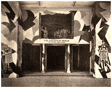
disruptive geezer theatre doors / wartime propaganda

Above This photograph was published in an American theatre magazine during World War I. It shows the decorated entrance of a Broadway theatre in which disruptive abstract patterns (not unlike the confusing dazzle camouflage being applied at the time to merchant ships) have been used to contradict the building's physical form. 

It was common at the time for "scenic artists" (theatre and film set designers) to be assigned to wartime camouflage. 

The treatment of this entrance was a way of promoting the screening of a 1918 short propaganda film titled The Geezer of Berlin, which was of course in reference to the German Kaiser, aka the Beast of Berlin, and the Clown Prince (in reference to his son). Disruptive patterns such as these not only cause visual confusion; they can also disturb the emotions, and, to some extent, designs like this anticipate the use of skewed perspective and shape deformation in avant-garde "expressionist" films, such as The Cabinet of Dr. Caligari. In a recent video, titled Ames and Anamorphosis, I have talked about the use of distorted perspective in that and other early films.

Sunday, October 16, 2022

Caligari, distorted film sets and WWI ship camouflage

Above
USS Nantahala
in dazzle camouflage scheme (1918).

•••

Herman George Scheffauer, “The Vivifying of Space” in The New Vision in German Arts. London: Ernest Benn, 1924—

[his description of The Cabinet of Dr. Caligari] Trees are resolved into conventionalized, constructed forms; foliage becomes a mass of light, dark and shaded crescents, rounds and silhouettes—brilliantly colored in the original scene. Floors and pavements are streaked, splashed and spotted, divided and decorated in bars, crosses, diagonals, serpentines and arrows. The walls become as banners or as transparencies, space fissued by age, or as slates upon which the lightning blazes strange hieroglyphs; or they become veils and vanish in a mosaic of scrambled forms and surfaces, like a liner in camouflage.

Gaunt chimneys rear and slant like masts in this city storm. Cunning lines of composition and the adroit use of diagonals drive the perspective into an invisible “vanishing point.”


For more on the Caligari film sets, forced perspective, and other early avant-garde cinema, see Part Three of my recently posted video trilogy on the Ames Demonstrations here.


Saturday, October 8, 2022

Part 03 has been posted / Ames and Anamorphosis

Unbelievable! At last I have completed it. Earlier this afternoon, I finished and posted on YouTube at <https://youtu.be/mxOEx2JLQBA> the third and final segment of a documentary trilogy on the life and work of Adelbert Ames II (known as Del Ames) (1880-1955), an American artist, lawyer, optical physiologist, and psychologist, best-known for having devised the Ames Demonstrations in Perception.

This part primarily focuses on Ames' influence on others, among them scientists, filmmakers, and artists, especially by his targeted use of anamorphosis (aka "forced perspective") in his well-known laboratory set-ups. It reveals the little-known links between Ames' experiments, Vorticism, and avant-garde filmmaking (Ballet Mécanique), as well as in popular culture, such as cinematic special effects and roadside tourist attractions.

In conclusion, it also provides a close-up look at the recent works of three contemporary visual artists, who, in one way or another, make astonishing use of perspective. They are Jan Beutener (Amsterdam), Richard Koenig (Kalamazoo MI), and Patrick Hughes (London).

All three parts of the trilogy (about 90 minutes in combined length) can be accessed online free at my YouTube channel at <https://www.youtube.com/channel/UCzYrUfsAvkZur5cBv6xlhSg>.  Of course, I am eager for others to see this. Do not hesitate to share it with anyone and everyone who might find it of value or interest.

Friday, September 9, 2022

Ames Demonstrations / replications of some of those

Fifty years ago, as a means of learning about the role of vision in art and design, I replicated a small number of the so-called Ames Demonstrations in Perception (as well as Dürer's drawing machines, Van Gogh's grid-based drawing frame, Alberti's perspective veil, stereo viewers and cameras, et al.). As shown above, I am looking into the back window of a small-sized Ames Distorted Room. Below is a much earlier newspaper article on this and other experiments by its originator, artist and psychologist Adelbert Ames II. Having published a number of articles on Ames and aspects of his life, I am now producing a three-part series of video talks, the first of which can now be viewed on YouTube.


Sunday, May 22, 2022

exhibition of hypothetical ship camouflage patterns

hypothetical camouflage schemes
Opening soon on May 24, 2022 (in the coming week) is a major gallery exhibition at the University of Wisconsin at Madison, which continues through June 24. Titled EVOLVING GRAPHIC DESIGN, it showcases the work of twenty-three graphic design professionals and design educators from throughout the nation. Represented is the widest variety of graphic media, including themes, research and techniques that extend beyond traditional prints on paper.

The exhibit’s originator, organizer and curator is Yeohyun Ahn, Assistant Professor of Graphic Design and Interactive Media, in the Graphic Design Program, UW-Madison Department of Art. Detailed information about the exhibition is online here.

I am pleased that my work is included in two components of the exhibition. In one will be exhibited a series of ten large-scale digital montages, called the Iowa Insect Series, that I made in 2012-2013 in collaboration with design colleague and friend David M. Versluis. Having retired from teaching recently, he now resides in Michigan. But at the time, he was a Professor of Art and Design at Dordt College in Iowa, while I was then on the faculty at the University of Northern Iowa. 


These works began with David’s high definition digital scans of various insect specimens from his collection. We worked together by what might be referred to as “blind collaboration.” To begin, he would email me one of the insect image scans. I then did something to alter or augment that image (somewhat like a move in chess), and returned the result by email to him. He then made additional alterations, and sent that second result to me. We continued blindly, back and forth, exchanging subsequent alterations, until we both began to sense that the work was nearing completion. We did this on ten occasions. All ten will be exhibited in the UW-Madison exhibition. No doubt the effect will be stunning.


In another area of the exhibition, I will also be exhibiting thirteen design-related images that are part of my long-term, continuing research (as a design historian) of World War I Allied naval camouflage. The theme uniting these artifacts is high difference or disruptive ship camouflage, which was referred to at the time as dazzle painting or dazzle camouflage.

Among the items exhibited are restored government photographs from the time period, full-color reproductions of diagrams of the camouflage patterns, and my own recent hypothetical camouflage schemes, derived from historical works of art.

 See examples, reproduced above.

A highlight of the exhibition will be a symposium, titled Evolving Graphic Design, to be held on June 23 and 24, in the Art Loft Conference Room, Art Lofts Building, in the Department of Art, University of Wisconsin-Madison at 111 North Frances Street, in Madison. I will participate in that symposium, by online presentation.

Thursday, September 2, 2021

speeding up the daily production of ship camouflage

During World War I, did any of the ship camouflage artists come up with clever procedures by which they could speed up the daily production of dazzle designs?

The answer is affirmative, although we do not know to what extent these were actually put into practice. Among the most ingenious was a method that originated with an American Navy camoufleur named Everett L. Warner. It was he who oversaw the ship camoufleurs in Washington DC at the Design Subsection of the US Navy’s Camouflage Section. Not only did he originate this method, he also documented it with photographs and described it in an article that was later published.

Here is what we know about his innovative method of producing new schemes for the sides of ships: At some point, he discovered that the painters at the harbors, who were applying the schemes to the actual ships, did not fully understand how various distortions worked. As a result, he initiated the practice of requiring small groups of those painters to attend training sessions at the Design Subsection. The distortion effects were a challenge to explain, and Warner soon found it was helpful to have on hand a number of cut-up, variously-colored wooden scraps to use in demonstrations.

One day, while preparing these demonstrations, Warner inadvertently arranged a number of these scraps of wood on the surface of a table. With no particular purpose, a wooden model of a ship, painted in monochrome gray, had been placed on the same surface, so that it served as a contrasting background. At that point, Warner realized that he could easily rearrange the scraps, in all but an infinite number of ways, and then use that arrangement as a flat, confusing pattern on the surface of the ship. If the scraps were aligned at an oblique angle, the plain gray ship behind them would appear to be positioned at the same angle. more>>>

Monday, March 1, 2021

diagram of a ship camouflage viewing theatre in 1918

Recently, we devised a diagram of the type of observation theatre (equipped with an upsidedown periscope) that was first used by the British and then the Americans (and most likely other Allies too) for testing dazzle ship camouflage schemes during World War I. 

Reproduced above is the left half of the diagram, showing two camouflage artists. Included in the diagram are American Navy camoufleurs Kenneth MacIntire (taking notes), and Harold Van Buskirk, who is looking through the periscope, trying to determine the angle at which a camouflage-painted ship model is headed.

As shown below in the right half of the diagram, the ship model was placed on an adjustable turntable, on the other side of a barrier wall. Behind that turntable was a painted canvas background that could be changed to simulate various visibility factors, such as weather or surrounding. Illumination could also be changed. The turntable (or perhaps the surface on which it was mounted) was marked with degree increments. When the periscopic observer had rotated the ship model to an angle that appeared correct, the person on the other side of the wall could easily tell the exact degree to which the observer’s adjustment was mistaken. The greater the error, the more effective the scheme would likely be in deceiving the periscope calculations of a U-boat gunner.

An especially clear, succinct account of the entire process (albeit, not every detail is fully correct) was published in the New Zealand Tablet, on January 29, 1920, including the following excerpt—

…a small wooden model of each ship was made to scale, on which was painted a dazzle design. This was carefully studied in a prepared theatre through a submarine periscope, and when the design had been so altered and arranged that it gave the maximum distortion, the model was handed over to a trained plan-maker, who fitted that design to scale for the particular ship it was intended. The plan was then dispatched to the port at which the particular ship was lying, and transferred to the vessel. Thus a model and plan were made for every ship. For each type a number of designs were made, so that on arrival at port any ship requiring a dazzle plan could be immediately camouflaged. Sometimes as many as 100 vessels were being painted at the same time in one port.

Not all WWI ship camouflage testing theatres were constructed just like this. Some were less elaborate, even makeshift, while others differed in other regards, but the overall principle was the same. 

SEE ALSO

Nature, Art, and Camouflage (35 min. video talk)

Art, Women’s Rights, and Camouflage (29 min. video talk)

Embedded Figures, Art, and Camouflage (26 min. video talk)

Art, Gestalt, and Camouflage (28 min. video talk)

Thursday, November 26, 2020

camouflage and the ames demonstrations in vision

Above Photograph of the author and a colleague in an Ames Distorted Room, a demonstration in perceptual psychology in which people seem to shrink and grow. It was first constructed in the 1930s by American artist, psychologist and optical physiologist Adelbert Ames Jr, at Dartmouth College. It has been replicated innumerable times, for a variety of purposes. This particular model was built in 1975, as one component in a participatory children's exhibit, co-designed by Roy R. Behrens (wearing dark jacket in photos above) and John Volker (not shown), and installed at the Waterloo Center for the Arts in Waterloo IA.

•••

To Make a Room Look Larger, in Ladies’ Mirror. Vol 5 No 4, October 1, 1926—

It is something of an art into which camouflage may be said to enter, that of creating the sense of space in a small room. 

RELATED LINKS

Ames, Heider and the Chair Demonstration

Wikipedia biography / Adelbert Ames Jr

Eyed Awry: The Ingenuity of Del Ames

The Artistic and Scientific Collaboration of  Blanche Ames Ames and Adelbert Ames II

Monday, November 23, 2020

Paris is dazzle-mad, seemingly part of a futurist dream

USS Aniwa (c1918), Type 9 Design D

Other People’s Troubles: A Paris Letter in The Sketch (London), October 13, 1920, p. 412—

Paris is dazzle-mad. I think every woman who has the courage to wear these dazzle furs that I see deserves the Legion of Honor. They are striped with great slashing streaks of white on black. Hats are dazzle hats. Dresses are dazzle dresses. Pajamas are dazzle pajamas. Everywhere are to be seen these angular lightning effects. The decorations most in favor in the very private and particular room are dazzle decorations. I seem to be existing in a weird Futurist dream.

Note There are no full-color photographs of WWI ship camouflage. The original of the black and white image above (US government, public domain) has been digitally “colorized” using AI software. While its light / dark values are accurate, the choice and location of colors, even when plausible, may not be literally correct.

RELATED LINKS 

it's not to fool the naked eye but the periscope instead

USS Boxley (1918)
Above US merchant ship, the USS Boxley (c1918), showing its World War I dazzle camouflage scheme (Type 10 Design I), which consisted of four colors: Black, gray-white, blue, and blue-gray.

•••

Helen Johnson Keyes, OUR MIGHTY SENTINEL CITY: She Stands with Naked Sword and Bayonet to Defend You and Me, in Farmer’s Wife, 1 July 1918, p. 31—

—what a strange object is that, over there! It is painted with curving, wavelike stripes of yellow, pink, lavender, blue, broken up by sudden splotches of other colors. 

It is a camouflaged vessel—a vessel to which has been applied what we call in the case of animals, “protective coloring.” It has been painted so as to blend with the sea and sky when seen at a distance through the eye of a submarine periscope. The camouflage does not conceal the boat from the naked eye which views it almost from its own level but to the periscope seeking it…the vivid, curveting stripes are thereby confusing…

Note There are no full-color photographs of WWI ship camouflage. The above image, from a black and white US government photograph in public domain, has been "digitally colorized” using AI software. While its light / dark values are accurate, the choice and location of colors, even when plausible, may not be literally correct.

Saturday, November 21, 2020

chalk lines used to mark out ship camouflage designs

USS Falmouth (camouflage unfinished)
Within earlier blog posts, including some in recent days, we’ve talked about the process by which World War I ships were “marked out’ with boundary lines to indicate color changes (using white or yellow chalk on a long stick, or, if within reach, a paint brush). The areas to be colored were then labeled with various letters to designate the paint colors to be applied.

We know this in part because a few of the people who painted camouflage on ships published accounts of the methods they used. There are also wartime photographs of ships, in the process of being painted, in which the linear boundary markings are clearly visible. There were times when ships departed from the docks while only partly painted.

USS Falmouth (detail)


Shown here, for example, are WWI government photographs of the USS Falmouth, showing the vessel's port side (two views with a close-up detail), with clear evidence of its markings and the unfinished painted design (Type 10 Design H).

USS Falmouth (alternate view)


Related Links
The Ubiquity of Camouflage in Human Experience
Perspective Distortion in World War I Camouflage
Other online sources

Marking out and painting ship

Wednesday, November 18, 2020

fad, fancy or illusion—camouflage is without limitations

Port side of USS Milton (1919)

Above
Since yesterday, when we blogged about the camouflage of the USS Milton and reproduced a photograph of the dazzle pattern on its starboard side, I have received more information about the same ship. Aryeh Wetherhorn, an American Navy veteran, who is now based in Israel, has provided a photograph of the port side of the Milton (as shown above, although of course I could not resist tampering with it, in hope of revealing more detail), as well as photographs of the original camouflage plans. Reproduced below is a close-up detail of one side of that ship’s camouflage scheme.

When the initial plan was issued during World War I, it was designated by US Navy camoufleurs as Type 10 Design L. According to Wetherhorn, not only was this scheme applied to the USS Milton, but to three other ships as well: USS Alpaco, USS Baxley, and USS Botsford. The colors employed in its paint scheme were black, gray-white, and two variants of blue (distinctly different from the AI colorized version above). 

Colored renderings of this plan (as well as scores of others), prepared by Talya Shachar-Albocher, have been reproduced in a new book that Wetherhorn published earlier this month. Titled The Easter Egg Fleet, it is available through Amazon.


•••

Mrs. J.D. Love, EL PASO WOMAN’S FORUM, in El Paso Times (El Paso TX), March 3, 1919—

Camouflaging in time of peace, as well as in war, appears to be without limitations. We hear it on every side; we see it where we look. Is it a fad, a fancy or an illusion, an imported fashion, a licensed privilege or a contagious disease?

Whatever it is, it has gripped the merchant, the lawyer, the doctor, the tailor, the butcher, the baker, the candlestick maker. The artists have gone mad and now that the musicians are under its spell—I dare not predict its fate.

Tuesday, November 17, 2020

bewildering the camera's eye with dazzle camouflage

USS Milton (1919)

Above
Photographic view of the dazzle camouflage scheme for the USS Milton, c1919, during World War I. As a closer look reveals, the ship had departed the harbor before its camouflage pattern had been completely applied. In the detail view below, one can see the unpainted regions, each of which has been marked with a letter to indicate the color that has yet to be applied. 

An AI colorization process has been used to add the color to this vintage black and white government photograph. While the effect is plausible, it is not literally correct.

•••

ARTIST VS PHOTOGRAPHER in The Princeton Union (Princeton MN), March 25, 1920—

Early in the submarine campaign, one of our boats was given a coat of camouflage, and when the vessel sailed from its pier in the North River, New York, the owners sent a photographer two or three piers down the river to photograph the ship as she went by. He [the photographer] took the picture…but when the negative was developed, much to his astonishment, he found that the boat was not all on the plate. In the finder of his camera, he had mistaken a heavy band of black paint for the stern of the ship, quite overlooking the real stern, which was painted a grayish white. The artist had fooled the photographer and at a distance of not more than 200 or 300 yards. 

Detail


Monday, September 28, 2020

Everett Warner and WWII Disruptive Ship Camouflage

Reproduced below is an extremely rare photograph of a small team of US Navy ship camouflage artists during World War II. In the center foreground, holding a ship model, is Everett Longley Warner, who was the Chief Civilian Aid in charge of ship camouflage. Warner had served in a similar capacity during World War I. The person in the top left background is unidentified, but the remaining five staff members are (l to r) Bennet Buck, Sheffield Kagy, William Walters, Arthur Conrad, and Robert R. Hays. It was Hays who provided a scan of this photograph when we corresponded with him in the 1990s.


In researching naval camouflage, I have typically emphasized WWI, largely because, as an artist and designer, it is far more intriguing to me than WWII, and, more generally, because I am less interested in military technology than in parallel form developments in camouflage (natural and military) and Modern-era art and design.

Related to that, it has always puzzled me to find that, when I speak to audiences about WWI dazzle ship camouflage, a common response is for people to say that such “high difference” confusion patterns must only have been used in WWI, because (or so they assume) non-visual means of detection (such as radar) were predominant during WWII.

Yet, if I look through my archive of ship camouflage photographs (see examples of WWII below, c1944-45), I easily have as many or more examples of “disruptively patterned” ships from WWII as I have from WWI. An additional consideration is that the same person (Everett L. Warner, as noted above) was responsible for ship camouflage in both World Wars.

USS Passig
USS Lenoir
USS Breckenridge


This is not to say that pattern disruption in WWI and WWII were the same. They were not. As I tried to explain in an earlier published essay, titled Disruption versus Dazzle: Prevalent Misunderstandings about World War I Ship Camouflage (2018), disruptive patterns were still widely used in WWII, but with an important distinction. 

WWII ship camouflage was no longer addressed solely or primarily to the viewpoint of a U-boat periscope, but to multiple observation points, such as the view from the deck of a ship, or from an airplane’s overhead view. As a result, as shown by WWII ship camouflage plans, it became essential to apply disruptive patterns to the horizontal surfaces of a ship, surfaces that would not have been visible during WWI from the viewpoint of a German submarine.

Unless I’m mistaken, this issue has largely been ignored by others who research the subject. But there is at least one exception. It is discussed in an online paper titled Naval Camouflage and its Application on HMC Ships REGINA and MONCTON: A Brief History, published in March 2020. Its author, Timothy Choi, is a doctoral candidate at the University of Calgary’s Centre for Military, Security and Strategic Studies.

RELATED LINKS

Ship Shape: A Dazzle Camouflage Sourcebook

Khaki to Khaki (dust to dust): The ubiquity of camouflage in human experience

Chicanery and Conspicuousness: Social Repercussions of World War I Ship Camouflage