Friday, December 30, 2016

Maximilian Toch | Camouflage Artist-Scientist

American chemist and camoufleur Maximilian Toch (1907)
Above Portrait of American chemist and paint expert Maximilian Toch, as President of the Chemists' Club (1907), photographer unknown. Original photo from the Chemical Heritage Foundation (Wikipedia), with digital color added. 

•••

Born in New York, American chemist and paint expert Maximilian Toch (1864-1946) earned undergraduate degrees in chemistry and law at New York University (1886), then went on to graduate work at Columbia University. He taught chemical engineering at Cooper Union, and at the University of Beijing. He also lectured on organic chemistry at Columbia (1905-06), and the City College of New York (1909), and later taught industrial chemistry at Cooper Union (1919-1924), and painting chemistry at the National Academy of Design (1924-36).

New York Times (“Dr. Toch” 1946:23): The cement-filler treatment used in the construction of the Panama Canal was developed by him.

Cervaux (2013): [Toch's] primary focus was the interaction between paint materials and the steel and concrete that had become mainstays of urban architecture. He sought paints specially adapted to the job of protecting and beautifying the modern city…[As early as 1908] Toch Brothers products were in use in structures from the New York Public Library to the San Francisco branch of the US Mint. As Toch delivered lectures and published articles in chemistry journals, the scientific reputation of Toch Brothers and its chief chemist grew in tandem.

New York Times (ibid.): He is credited with developing the original battleship gray formula used by the United States Navy, and during the first World War was called America’s first camoufleur. He had charge of camouflage of the East Coast defenses at that time also, and developed the Toch system of camouflage.

Toch’s opinions regarding chemical evidence in the authentication of art became controversial in 1931, when he claimed that all but one of the Metropolitan Museum of Art’s Rembrandt paintings (about thirty at the time) were not genuine, and that of four hundred paintings attributed to Rembrandt in collections worldwide, only forty-eight could be scientifically verified. He defended his claims in a book Paint, Paintings and Restoration and other books on authentication methods in art. He was the uncle of art materials expert Ralph Mayer.

Toch (1919): It was my good fortune the first week of the war [WWI] to be called down to the Navy Department to the Bureau of Yards and Docks, which department really took up the first camouflage of the United States, and I had the mission thrust upon me of going along the coast of the United States and designing and executing the camouflage of the yards and docks and a number of fortifications… When I was called to Washington during the first week of the war, it was because in 1915 I had camouflaged two forts at Panama. In those days the word ‘camouflage’ was totally unknown. The words used were ‘military concealment,’ and on the question of the visibility of color [blending] and juxtaposition of  color [dazzle], these two fortresses which contained disappearing guns were given to me to distort and to lower their visibility…

The first workers on ship camouflage were Messrs. [William Andrew] Mackay, Gerome Brush, Louis Herzog, Lt. [Everett L.] Warner and myself, and of course in those days we didn’t have the guidance of the brilliant scientific research of Messrs. [Harold] Van Buskirk, Warner and [Loyd] Jones.


Toch (“Camouflage of Ships” 1919:154): The Shipping Board, in conjunction with the navy, found it advisable to adopt methods for lowering the visibility of ships, and the important information this subject which the public ought to know, is that if anybody thinks a ship can be lowered in visibility to a point where it becomes totally invisible, he is thoroughly mistaken. No ship, however thoroughly it may be camouflaged, can become invisible against the rising or setting sun. I have shown photographs of white flying birds and camouflaged ships against the light which show their total opacity. The navy adopted four systems, viz., the Brush, Herzog, Mackay and Toch systems, and, later on, the Toch [sic, should be Warner] system. But Admiral Sims, in 1918, decided that the Wilkinson system, which bore great similarity to the Toch system, excepting that Wilkinson used blue where I used green, be adopted by the English and the Americans.

Toch ship camouflage plan (c1917)


The total effect of ship camouflage is one of distortion and not of the lowering of visibility, and a ship properly camouflaged becomes so distorted that it is impossible to tell its correct direction within twenty-five degrees. This I determined for myself by having spent a day at sea in one of our submarines, which the camouflaged ship Parthenia accompanied us, and in five range-finding operations showed up from 10 to 18 percent, and in no case, even at 600 yards, which is point blank fire, could the Parthenia have been hit by the U-boat from which I made my observations.

Toch (1931:308): In the beginning of the War [World War I] we all thought it was perfectly possible to lower visibility until you could not see the object. We learned that this is impossible, so I worked on the coloration concealment of Abbott Thayer, because I was one of the fortunate possessors of his book, which had long been out of print and which he personally had given me. I am frank to say that without his book, my slight knowledge of physics, chemistry, and optics would not have stood me in good stead.

Toch (Ibid.:308): Early in May, I was hurriedly called down to the Shipping Board, and they read me a report from the captain of the [USS] Luckenbach, in which he stated that the Toch system of camouflage was no good and did not lower visibility; that some other method ought to be tried, and he concluded by saying that one thing he did notice was that he could not tell which way the camouflaged ships were going.


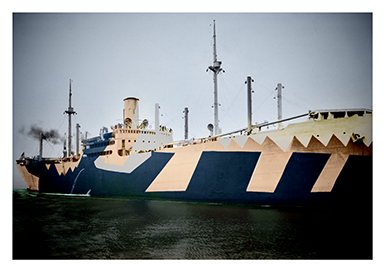
USS Katrina Luckenbach (hypothetical digital colors)
I immediately saw that here we had at last the solution to our problem: that to lower visibility to the point of extinction was utterly impossible in physics and in optics, and I explained to the Shipping Board that every effort must be made to forget this but to try and distort direction.

Toch (Ibid.:309): [Having been painted in disruptive camouflage]…a ship not only became foreshortened but its direction was so distorted that when I went out to sea in a submarine and fired some dummy shots at one of my own camouflaged ships, I missed the boat at as short a distance as 600 meters.
 

Early in January [1918], the Eastman Kodak Laboratories were enlisted in the studying of the lowering of visibility. I went to Rochester and consulted with their physicists; but I stood my ground that the lowering of visibility was not what we were after but distortion of direction, and in the end most of the ships were camouflaged by this method.

In Warner ("Summary of Points"), it is stated that the USS Kajeruna was camouflaged using the Toch System, c1917, and in January 1918, two other ships, the USS Huron and the USS Aeolus were also painted using the same system (Section H).

Toch on horseback [detail] (1940). Wikipedia.


Sources
Behrens, R. (2009), CAMOUPEDIA: A Compendium of Research on Art, Architecture and Camouflage. Dysart IA: Bobolink Books.
__________ (2012), SHIP SHAPE: A Dazzle Camouflage Sourcebook. Dysart IA: Bobolink Books.
Cerveaux, A. and E. Hepler-Smith (2013) “Quest for Permanence” in Distillations. Chemical Heritage Foundation. Online at <https://www.chemheritage.org/distillations/magazine/quest-for-permanence>.
“Dr. Toch, Chemist and Art Expert, 81” (1946) in New York Times (May 31), p. 23.
Hendrick, E. (1929), “American Contemporaries: Maximilian Toch” in Industrial Engineering and Chemistry Vol 21 No 7 (July), p. 704. Online at <http://pubs.acs.org/doi/abs/10.1021/ie50235a028>.
Toch, M. (1918) “The Fine Art of Military Camouflage” in Munsey’s Magazine Vol 64 No 1 (June), pp. 5-8.
_______ (1919a) “Camouflage of Ships” in Pacific Marine Review, 154.
_______ (1919b) “Discussion” in Transactions of the Illuminating Engineering Society Vol 14 (July 21), pp. 230-232.
_______ (1931) “Adventures in Camouflage” in The Military Engineer Vol 23 (July-August), pp. 307-309.
Warner, E. (n.d.) “Summary of Points to be Made in a General Lecture on Marine Camouflage.” Unpublished typescript.

Sunday, November 20, 2016

Tom Benton, Frank Lloyd Wright and Camouflage

Thomas Hart Benton, Report on Camouflaged Ship (1918)
Above In earlier posts, we've noted the involvement of American Regionalist painter Thomas Hart Benton (see portrait below) in World War I camouflage. While he served in the US Navy, he did not design ship camouflage. Instead, his assignment was to travel around the bay at Norfolk VA, and to make visual records of the camouflage designs of any ships that he observed, including those of other countries.The page above is a record of one of those sightings, including full-color renderings of the camouflage schemes on both sides of the SS Alban (dated October 30, 1918).

There's a great story about Benton and American architect Frank Lloyd Wright. It's told in Priscilla J. Henken, Taliesin Diary: A Year with Frank Lloyd Wright (New York: W.W. Norton, 2012), p. 35—

[There is] an amusing story of the [Taliesin] Fellowship's overnight stay at the Benton home in Kansas City, on the way [from Spring Green WI] to camp [at Taliesin West in Arizona]. All the boys [sans F.L. Wright, who made the trip separately], including the short, square, black-moustached Thomas Benton had imbibed freely. While he swung in wide arcs from a swing with 25-foot long ropes, the boys stood on the porch singing to Kansas City till the wee hours Palestrina, Bach, spirituals, and folk songs. Then he and his sons entertained them with chamber music composed of harmonicas and recorders.

Benton Family Musicians


In the new book on Frank Lloyd Wright and Mason City: Architectural Heart of the Prairie (2016), there is a discussion of the connections between Wright's architectural style and Benton's approach to painting.

Frank Lloyd Wright and Mason City (2016)

Saturday, November 19, 2016

Forced Perspective, Stage Design and Camouflage

Above Only a few days ago, an essay that I recently wrote on forced perspective (commonly used in stage design and museum dioramas) and World War I ship camouflage has been published online at the website of Aisthesis (an Italian journal published by the Firenze University Press), where it can be read online or downloaded as a pdf.  The essay, titled "Setting the Stage for Deception: Perspective Distortion in World War I Camouflage," appears in the current, special issue on Mimicries in nature, art and society. Vol 9 No 2 (2016).

Sunday, November 6, 2016

The History of Camouflage | YouTube Video

The Fine Print | History of Camouflage | Episode One
Above Forty-five years ago, when I first published articles on art and camouflage, no one was even remotely interested. Now it seems as if everyone is researching camouflage, even hip hop. It's been a long and often enlightening search.

Here's the lastest: A seven-minute online video, produced by Mountain Dew's Green Label, the first of three episodes, titled The Fine Print: The History of Camouflage. Enjoy.

Warner, Waugh and Camouflaged Ship Model

Everett L. Warner with ship model (c1918). Courtesy NARA.
More than two years ago, in a blog post about World War I American artist Frederick Judd Waugh (1861-1940), we reported on his camouflage plan for the USS Proteus, a cargo ship for carrying coal. We included two photographs at the time, one showing the painted wooden ship model (reproduced below), as prepared by Waugh, the other a view of the actual ship after the scheme had been applied.

More recently, we have located another photograph of Waugh's model (above). It shows Everett Longley Warner (Waugh's immediate supervisor) standing beside an observation theatre, used for testing ship camouflage plans. The ship model has been placed on a circular turntable that can be angled at any degree. Also evident is a painted backdrop on a roll of canvas, which allows the background to be changed, to simulate various weather effects.

Close-up view of same ship model

Sunday, September 25, 2016

Stripes, Checked Suits and Camouflage La Bohème

Anon, cover photograph of The Sketch (1919)
Above This photograph (attributed to the Western Newspaper Union) was published on the front cover of The Sketch magazine in London on Wednesday, June 18, 1919 (No 1377 Vol CVL). The headline beneath it reads DISPLAYING HER 'STRIPES," BUT HIDING HER HEAD: ZEBRA EFFECTS IN HOSIERY AND PARASOL. A clarifying caption states—

The vogue of the stripe—which has affinities, perhaps, with the new "dazzle" designs born of naval camouflage—is very prevalent among the votaries of summer fashions. Here is an example, which was carried out in blue and white, from the other side of the Atlantic. It would turn a tiger or a zebra green with envy.

While it is tempting to say that stripes and other high contrast optical patterns were caused by the adoption of dazzle ship camouflage during World War I, there are also reasons to conclude that the practice is quite a bit older than that. There is a section related to this in Virginia Nicholson, Among the Bohemians: Experiments in Living 1900-1939 (New York: HarperCollins, 2002), pp. 151-152—

[If one were on the lookout for Bohemian artists, a telltale attribute would be] an ostentatious pair of checked trousers or a checked suit, which cropped up like the measles wherever artists gathered together. These dazzling checkerboards of Op art squares danced down the legs of poets, painters and poseurs from Chelsea to Paris. Paul Nash dashed off an illustration to [Dora] Carrington, showing himself squared up like a bistro tablecloth. "I have just got a check suit that will stagger humanity. My word it is a check suit." They were really very loud—the point being, that nobody could mistake you in a crowd. The Punch cartoonist who wanted to depict a Bohemian artist invariably tricked out his legs in check. When he became more confident, [Mark] Gertler wore them instead of evening clothes, while the painter Michael Wickham teamed his with an orange-sprigged waistcoat. [Walter] Sickert got himself to look like a bookie in checks and a bowler. Evelyn Waugh overdrew at the bank to purchase a pair of checked trousers in 1925, and Dylan Thomas dressed in loud check suits because the thought they made him look like a successful scriptwriter. My father, Quentin Bell [of Bloomsbury Group fame], used to wear blue and white checked trousers bought from a cooks' outfitters in Old Compton Street, but the pattern gradually disappeared beneath incrustations of plaster.

Thursday, September 15, 2016

Camouflage Through Purposeful Shadow Disruption

Paul Strand, Porch Shadows (1916)
Above Photograph by Paul Strand, titled Porch Shadows (1916)•. Courtesy Library of Congress. Public domain.

Strand was one of a number of photographers before and after World War I who relied on a well-known shadow effect that resembles the patterns of venetian blinds. Other examples are easily found, notably in the photographs of Max Dupain••, Harold Cazneaux, Alexander Rodchenko, and Laszlo Moholy Nagy.

As mentioned in an earlier post, disruptive shadow effects are also frequently found in paintings in the latter part of the 19th century, especially Impressionist. Among the most compelling is John Singer Sargent's masterful Breakfast in the Loggia (1910), which is reproduced below.

John Singer Sargent, Breakfast in the Loggia (1910)


In the early years of World War I, military camoufleurs began to apply disruptive patterns to vehicles and other equipment, to purposely break up their shapes. Soon after (probably as a consequence of a proposal by British painter and camouflage officer Solomon J. Solomon), it became evident that disruptive patterns can also result from the shadow effects of the overhead sun. Nets suspended overhead, garnished with scraps of fabric, could break up any components below, without applying any paint. We've talked about this earlier as umbrella camouflage.

Of course, this was nothing new. Today the same effect is seen on a tennis court, when the shadows of the chain link fence break up the shape of a lost ball in the grass. In an issue of the Illustrated London News (August 31, 1918, p. 233), this disruptive shadow effect was demonstrated in a photograph (shown below) of a group of soldiers inspecting a supply of ammunition, stored beneath a garnished net.


At the end of the war, non-military examples of shadow disruption were published in an issue of The Sketch (May 22, 1919, p. 209), with the headline: SUN PICTURES! LIGHT EFFECTS IN A FEZ BAZAAR: A Picturesque Network Effect of Light and Shade: Interesting French Photographs of a Covered Market at Fez. One example is shown below.


Finally, it is only fitting to conclude with one of the best-known photographs of shadow distruption (below) by the Russian Constructivist Alexander Rodchenko, titled Girl with a Leica (c1933).

There is some disagreement about the proper orientation of Paul Strand's photograph. Should it be in vertical format, as shown here, or should it be horizontal instead, with the circular table in the upper right corner? It is most commonly reproduced as a vertical.
•• Australian art historian Ann Elias has written extensively on Max Dupain and the purposeful use of shadows in photography and camouflage.

Friday, September 9, 2016

Scandalous Dazzle Camouflage Swimsuits 1919

Above As we've discussed in earlier posts, much fun was had by pundits and the public in 1919 when young British women began to appear on the beach in Margate, in swimsuits based on wartime dazzle camouflage schemes. We've published news photographs of a few of these before, but of late have located clearer, more detailed examples. The one shown above and two versions of another one (below) were widely published at the time by various European, Australian and American news sources, Le Modes, The Sketch and New York Tribune among them.

We also discovered a wonderful pen and ink drawing (artist unknown, with credit to the Daily Paper) that appeared in a mid-1919 issue of The Sketch, as reproduced below. It shows a well-fed beach custodian, looking in amazement at three women in dazzle camouflage swimsuits. Beneath the headline of "DAZZLE" DAYS is the following caption—

Even the bathing costume has been reborn by the war, and camouflage is the order of the day. 


Godawful Poesy and Sorolla Ship Camouflage Plan

Above This is the cover of the printed sheet music for a World War I-era song titled The Camouflage March (1918). The words and music are by Horace B. Blan (a New York attorney). There is an online version of the original at the Library of Congress website here that can be downloaded as a public domain pdf. We would reprint the lyrics were they not so poorly written.

Note the dedication to the employees of the Standard Shipbuilding Corporation. Not surprisingly, in the background at the bottom is a drawing of a dazzle-camouflaged merchant ship.

•••

Below A hypothetical dazzle-camouflage plan, in the style of Spanish painter Joaquin Sorolla y Bastida (1863-1923).

Dazzle scheme ala Sorolla

Monday, September 5, 2016

Futurist Views: Nevinson, Bertram Park and Dazzle

C.R.W. Nevinson (1919)
Above Of the World War I British war artists (assigned not as combatants, but as eyewitness artistic observers) undoubtedly one of the finest was a so-called Futurist painter and printmaker named Christopher Richard Wynne Nevinson, who is nearly always listed as C.R.W. Nevinson (1889-1946). His dramatic portrayals of aerial flights are especially compelling, as in the colored lithograph above. Titled Banking at 4000 Feet, it was initially published as a colorplate in J.E. Crawford Flitch, The Great War: Fourth Year: Paintings by C.R.W. Nevinson (London: Grant Richards, 1918).

As striking as Nevinson's work may be, neither it nor he were ever immune to being satirized in the public press, who always had trouble accepting the use of disruption, distortion and abstraction in styles of Modernism (Cubism, Futurism, Vorticism). This attitude persisted (and still persists, to large extent) even after art defenders claimed that those were precisely the methods employed in the design of disruptive wartime camouflage, called dazzle-painting.

For example, reproduced below is an innovative photographic portrait of Nevinson, which appeared in The Sketch (May 21, 1919, p. 143), on a page that bears the headline A "CUBIST" CUBED—BY THE CAMERA. Beneath the photograph, there is a smaller heading that reads Nevinson—Reduced to His Own Artistic Formula.

Portrait of C.R.W. Nevinson by Bertram Park (1919)

As it turns out, this experimental photograph was made by none other than Bertram Park, a well-known British society photographer (somewhat avant-garde himself), whom we have previously blogged about in relation to his photographs of the outlandish costumes at the Chelsea Arts Club Dazzle Ball. Below the Park photograph, we are provided with the following caption—

Before the war, Mr. C.W.R. Nevinson was associated with the Futurist movement in art, but his peculiar style of cubism and realism combined was not developed until 1916, when he held his first War Exhibition, and was appointed an official war artist. He has painted pictures for the Canadian War Memorial, and many of his works have been bought by museums—at home and abroad. The above photograph of the Cubist artist by a camera converted to Cubist convention was taken recently, before Mr. Nevinson sailed for America. It is, to say the least, unconventional.

•••

That same year, in the August issue of Current Opinion, Park's photographic portrait of Nevinson was reprinted (as shown below) in a two-page feature on Nevinson's assertion that Cubists and Futurists Had a Presentiment of the Coming Conflicts. Appearing in the magazine's section on Literature and Art, the headline for the article was HOW THE WAR VINDICATED "MODERN" METHODS IN ART


As quoted from an interview in the Times, here is part of what Nevinson said—

This war did not take the modern artist by surprise—it only knocked the old fellows, who were tied up to old ideals of art, off their feet. I think it can be said that modern artists have been at war since 1912. Everything in art was a turmoil—everything was bursting—the whole talk among artists was of war. They were turning their attention to boxing and fighting of various sorts. They were in love with the glory of violence. There were dynamic, Bolshevistic, chaotic.

…Everything was being destroyed; canons of art were everywhere sacrificed. And when the war actually came, it found the modern artist equipped with a technique perfectly able to express war.

…Now that art has had its orgy of violence there has been an abrupt reaction. The effect of the war has been to create among artists an extraordinary longing to get static again. Having been dynamic ever since 1912, they are now utterly tired of chaos. Having lived among scrap heaps, having seen miles of destruction day after day, month after month, year and after year, they are longing for a complete change.

Sunday, September 4, 2016

Dazzle-Painted Lilies of the Field—and Pajamas

A view of camouflaged ships in dock by R. Guy Kortright (1919)
Above A painting of dazzle-painted British ships, by (Reginald) Guy Kortright (1877-1934), a Canadian-born British painter who served as a navy lieutenant in World War I. With John Everett and (Lawrence) Campbell Taylor, he was assigned not to design ship camouflage schemes, but to record his observations of such ships, through various onsite paintings. As evidenced by the one above, the results were inevitably striking.

Other sources of full-color reproductions are cited in an earlier post. The image shown here was published (along with two others by L. Campbell Taylor) in a page of full-color images in The Sphere on March 22, 1919, p. 259, with a heading on the page that reads WHEN THE DOCKS PUT ON RAIMENT AS THE LILIES OF THE FIELD. On the page before is an unsigned half-page article on DAZZLE-PAINTING AND ITS PURPOSE.

•••

Unsigned, "Other People's Troubles: A Paris Letter" in The Sketch (October 13, 1920, p. 412)—

Paris is dazzle-mad. I think that every woman who has the courage to wear these dazzle furs that I see deserves the Legion of Honor. They are striped with great slashing streaks of white on black. Hats are dazzle hats. Dresses are dazzle dresses. Pajamas are dazzle pajamas. Everywhere are to be seen these angular lighting effects. The decorations most in favor in the very private and particular room are dazzle decorations. I seem to be existing in a weird Futurist dream.

Below A cartoon also from The Sketch (May 21, 1919, p. 226), attributed to the Daily Paper, for which the accompanying caption reads—

A Futurist friend of mine is designing his own coffin. He means it to be some funeral.

Anon, A Futurist Coffin (1919)

Saturday, September 3, 2016

Chelsea Arts Club Dazzle Ball 1919

The Sketch (March 19, 1919)
Among artists, designers and architects, there is a long tradition of sponsoring annual costume balls, fancy dress balls, or Beaux-Arts balls (not unlike the Mardi Gras), often amusingly raucous events, for the purpose of fundraising. At a Beaux-Arts ball in New York in 1931, for example, some of the city's most famous architects came dressed in costumes that were modeled after their own famous buildings. Among artists, given their fabled Bohemian bent, these parties typically turned into riotous fests of uninhibited and inebriated revelers, dressed in astonishing costumes (or, sometimes, barely dressed at all).

One of these events was the annual Chelsea Arts Ball in England, which the Chelsea Arts Club (founded in 1891) had sponsored at the Royal Albert Hall. The annual celebration was interrupted by World War I, which began in 1914, and only near the end of the war, in 1919, was it decided that the Chelsea Arts Ball could resume. This time however the theme chosen was the disruptive crazy-quilt patterns that had been applied to wartime dazzle-painted ships, intermixed with the public's bewilderment toward emerging styles of Modern Art: Cubism, Futurism, Vorticism, Surrealism and Dada. As a result, the 1919 fancy dress ball (held on the evening of March 12, 1919) became known as the Chelsea Arts Club's Dazzle Ball.

The event was widely covered by newspaper and magazine articles, as had been an earlier American "camoufleurs' ball" that took place in the winter of 1917 at the Willard Hotel in Washington DC, and a camoufleurs' "carnival ball" (sponsored by the League of American Penwomen) that was also held in Washington in February 1919. We've discussed these events in earlier blogposts, including an account of a comparable dazzle ball (modeled after the Chelsea Arts Club festival) that took place in Sydney AU on October 7, 1919.

In its March 22 issue, the Illustrated London News featured a spread of illustrations of the costumes and the dancing that had taken place at the Chelsea Arts Club's Dazzle Ball. A few days earlier, in its March 19 issue, The Sketch included on its front cover photographs of costumes that premiered that night (see cover reproduced above). At the bottom of the cover is a headline that reads THE GREAT "DAZZLE" BALL OF THE CHELSEA ARTS CLUB; HUMAN CAMOUFLAGE, and below that is this paragraph—

After an interval of five years, the Chelsea Arts Club once more gave a great fancy dress ball, last Wednesday, March 12. The Albert Hall was decorated for the occasion with a wonderful scheme of "Dazzle," as used in naval camouflage during the war, and a great many of the costumes were designed on similar lines. A good example is seen in the left-hand lower photograph, showing Mrs. Bertram Park (neé Yvonne Gregory), who is well-known as a painter of miniatures.

That portrait of Yvonne Gregory Park (she herself was also a photographer), which was taken by her husband British photographer Bertram Park, is easily the best-known photograph of a costume from the Dazzle Ball. Equally wonderful is the photograph at the bottom right of the cover, showing two women, one draped in the American flag, the other in the Union Jack.

In the same issue of The Sketch (listed by HathiTrust Digital Library as in public domain in the US) is another full page of costumes, on page 353 (as shown below), this time with the page headline ON THE RAZZLE DAZZLE: COSTUMES AT THE CHELSEA ARTS and then at the bottom of the page, a smaller second headline reads: THE "DAZZLE" BALL OF THE CHELSEA ARTS CLUB, AT THE ALBERT HALL: SOME NOTABLE FIGURES, followed by this paragraph—

The Sketch (March 19, 1919)


As already mentioned, the Chelsea Arts Ball on March 12 was a wonderful success. The Albert Hall presented literally a "Dazzling" spectacle. Our central photograph shows Miss Margot Kelly, who recently left "Oh, Joy," at the Kingsway, to appear shortly in a new American comedy. She is wearing a Columbine dress of her own design. To the left of her is Mrs. Barribal, wife of a well-known artist whose work is familiar to our readers, in a costume which she made from an armchair cover.

On page 355 of that same magazine, there is a brief article (attributed to "The Worldling") that is titled The Chelsea Arts Ball and reads as follows—

It was a case of "dazzle-dazzle, joy and jazzle" at the Albert Hall last Wednesday night, when the long-heralded folic of the Chelsea Arts Club came off. As all the world knows, the scheme of decoration was based on the art of "Dazzle," as applied during the war to the disguising of ships and the discomfiture of U-boats. The same artists who did that work for the Admiralty—Lieutenant-Commander Norman Wilkinson, Lieutenant Cecil King, [American] Captain Burnell Poole, and Sergeant [Walter E.] Webster—had undertaken to camouflage the Albert Hall in similar style for the great occasion. The background was a "dazzle" battleship, with a "dazzle" sunset, and all the boxes were hung with muslin draperies in "disruptive" colors. The "dazzling" of the dancers themselves was left, of course, to their own individual ingenuity, and many artists had designed costumes for the camouflage of the human form. The effect was a whirling scene that delighted the hearts of the Vorticists.

In advance of the Dazzle Ball, The Sketch had published a page of preparatory drawings of four of the anticipated costumes, on page 292, on March 5 (in those drawings, Yvonne Gregory Bertram's striped costume is referred to as the "jazzle"). Following the event, a further, briefer note (underscoring the contributions of Cecil King and Walter E. Webster by name) appeared on page xii of the March 26 issue of The Sketch.

Apparently, The Sketch was enjoying a lively reader response to its features on the Dazzle Ball, and indeed it returned to the subject again in a cartoon (attributed to Thorpe) on p. 427 of the June 25 issue. Reproduced below, the headline of the cartoon reads: THE EVE OF THE FANCY-DRESS BALL, while the caption beneath it is worded IT'S A WISE CHILD THAT KNOWS ITS OWN MOTHER.

The Sketch (June 25, 1919)


There's much more to this—but we'll save it for a future post.

Thursday, September 1, 2016

Dazzle-Painting A Model Ship in Liverpool

Above On the National Museums Liverpool blog, there is a wonderful article on the construction and painting of two wooden dazzle-painted ship models. They were made in 2015 by ship and model conservators Chris Moseley and David Parsons, who reproduced two dazzle designs that originated with Norman Wilkinson in 1917. The site is all the more interesting because at the bottom it links to further photographs in a Flickr album called Making model dazzle ships.


Tuesday, August 9, 2016

Camouflage Artist | Mary (Mittie) Taylor Brush

George de Forest Brush, Mrs. Brush, c1888
Above George de Forest Brush and Mary Taylor Whelpley eloped (to the dismay of her parents) and married on January 11, 1886, on the bride's twentieth birthday. They were both artists, and for the rest of their married lives, he made beautiful portraits of her, most often holding one or more of their nine children (one died in infancy). This (my favorite) is his first portrait of her, dated c1888.

Having given birth to and raised so many children, how could Mary (better known as Mittie Taylor Brush) have the time and energy to do anything else? But she accomplished quite a lot. As is now currently featured in the August 2016 newsstand issue of the Smithsonian's AIR&SPACE Magazine (pp. 28-31), she was one of the country's first female aviators (as was her friend and sometime neighbor, Amelia Earhart), and the inventor of several attempts at airplane camouflage, by reducing its visibility (see her patent drawings below). As we have noted in earlier posts, her husband (a friend of Abbott H. Thayer) and their son (Gerome Brush) were also important contributors to World War I-era camouflage.

US Patent 1619100

Written by aerospace engineer Nick D'Alto, the title of the AIR&SPACE article is "Inventing the Invisible Airplane: When Camouflage Was Fine Art." It's a fascinating article, accurate and richly illustrated (although, oddly, her name is misspelled as "Mitty" throughout), and reveals (to great surprise) that parts of her airplane have survived. Discovered in a New Hampshire barn in 2011, its remains are currently on display at the Eagles Mere Air Museum in Pennsylvania.

US Patent 1293688

For a wealth of memorable stories about the Brushes and their married life, see their daughter's wonderful biography, George de Forest Brush: Recollections of a Joyous Painter (Peterborough NH: William L. Bauhan, 1970). See also Brush family articles and related info in CAMOUPEDIA: A Compendium of Research on Art, Architecture and Camouflage (2009).

Friday, August 5, 2016

Theatrical Stage Lighting and WWI Camouflage

Abbott H. Thayer's stage lighting effects: Before and After
Above In earlier posts, we've featured American artist Abbott H. Thayer's ideas about countershading, a method by which volumetric forms appear insubstantial, less thing-like. Using hand-painted wooden duck decoys, Thayer was one of the first to demonstrate the ease with which a viewer can be deceived by the calculated interplay of light and shade.

Less well-known are Thayer's theatrical lighting effects. In the pair of photographs above, he documented a full-body skin-tight leotard which he had skillfully colored with gradations of light and dark. On the left (with light from below), the human figure is clearly visible, while on the right (light source from above) the same figure has all but disappeared, simply by switching the lights.

Thayer applied countershading to other objects as well. Notably, he once countershaded a small cast of the Venus de Milo, which he installed in a display case in the town hall of Dublin NH. He precisely lit the statue with alternating light sources, so that "it was the delight of the school children to press the buttons and [by that] to make her come and go."

•••

Theatre set designers have long experimented with visual effects, especially stage illusions that make use of forced perspective. As noted elsewhere, theatre and film set designers made critical contributions to World War I camouflage. Thereafter, there was an increase of interest in duplicitous stage lighting. In the early 1920s, a number of news articles described the lighting experiments of a Russian-born theatre designer named Adrian V. Samoiloff, who devised a theatrical setting in which he could change the appearance not only of the scenery but also the props and costumes. All this was done in an instant, by a switch of backstage lights (100 different switches in all). The curtain remained fully open, and as the audience observes—

…behind the scenes, somebody does something and everything is altered in a flash. The grim mountains [the prior stage setting] become a Hindu temple, the frowning rocks melt into sands and palms, and the tall, slender young woman becomes a stout Indian maiden.

Variations on this technique were soon widely adopted and are generally known today as the Samoiloff Effect. When asked at the time if these methods were new, Samoiloff replied—

Well, all the elements of it have been known for years; I have merely brought them together and worked them out scientifically and systematically. Do you remember, for instance, the postcards we had as children, which showed one inscription in one light and another in another? Well, that's part of it. Then during the war [WWI] we heard a lot about "dazzle" and camouflage, and how a few apparently random lines of paint would alter to the distant observer the shape of the outline of a vessel. That's part of it, too. I have merely worked along these and similar lines until I got the results I wanted.

Samoiloff's indebtedness to military camouflage is tacitly supported by another article (Variety, October 1921), in which he is said to have worked as "a designer of scenery for the Imperial theatre in Petrograd" who "was loaned to the British Navy during the war." Later, while living in London, the first theatrical production in which Samoiloff used his lighting effects was "The Valley of Echoes" at the Hippodrome in 1921. To accomplish this, he used a mechanism that "resembles a small traveling crane, operated from a table, and it runs on a system of tiny railway lines."

In the same year, a comparable effect was achieved by another designer named Nicholas de Lipsky (purportedly a Russian prince and a protege of ballerina Anna Pavlova), who introduced it in New York at the Shubert Theatre for a dream sequence in "The Greenwich Village Follies." It seems likely that Samoiliff and de Lipsky were associated, and as implied by articles that note that "Samoiloff and de Lipsky appear to have come from the same Russian school," and that both had somehow been involved in wartime camouflage. Both may also have been allied with the Hippodrome in London.

Through the Hippodrome, de Lipsky had become friends with an American set designer named Roy Pomeroy (in the US, he was the first recipient of an Academy Award for special effects) who had invented special cameras for the British during the war, including one that "could be used to render camouflaged objects detectable." (A source that contradicts this claims that Pomeroy conducted photo experiments for the US, not the British.) After the war, Pomeroy and de Lipsky apparently worked together on a scene-altering lighting system (different from that of Samoiloff) that was partly based on this photographic process for deciphering camouflage. In de Lipsky's case, there are surviving photographs (see below) that show two views of the same stage production and its costumed cast. The performers have not changed costumes, but are simply illuminated by two different sets of lights.

de Lipsky's stage set transformation (1921)

Oddly enough, there was another invention announced in 1921 that used alternating light sources to make objects disappear or to change appearance. Did one predate the other, or were they discovered concurrently but independently?

We've talked about some of these before because they were developed by an American artist-scientist named Charles Bittinger.  It was interesting to learn that his stepbrother was the painter Marsden Hartley. But it's even more interesting that, during both World Wars, Bittinger was a prominent civilian participant in the US Navy's camouflage research unit.

Judging from an article by Henry Chapin called "Two Pictures on Single Canvas" in the New York Evening Post (October 7, 1920), Bittinger's experiments may have predated the efforts of Samoiloff, de Lipsky and Pomeroy. Another article with much the same content (and a nearly identical title, "Two Paintings on the Same Canvas"), written by M(argaret) Fitzhugh Browne, was published in the following year in Popular Science Monthly (Vol 98, 1921, p. 30). The article shows two images that were painted by the artist on a single canvas—one is a portrait of a women, while the other shows a man and a horse. When viewed in ordinary light, only the portrait is visible; but when viewed under red light (aided by using a filter), the portrait vanishes and only the man and the horse can be seen.

In considering applications for Bittinger's discovery, the author writes—

The stage, with its demands for instantaneous and mystifying transformations, furnishes a very fertile field for this new art. In Mr. Bittinger's New York studio is a miniature stage set with a scene on the Riviera, which immediately changes to Madison Square in winter when the red light is switched on. Costumes, too, can be handled in endless effective ways by applying the principle to the dyes used and to the patterns in which the colors are put on. A chorus might come dancing on in dresses with horizontal stripes. The light changes—and instantly the stripes are vertical; and so on in infinite variety.

She then turns to potential applications in advertising and interior design—

Advertising, also, with its demands for "before and after using," or similar illustrations, is a sphere in which some striking results can be obtained; and there are even possibilities of house decoration—a frieze that would appear of one color and pattern by daylight, and of an entirely different design by artificial light.

In subsequent years, Bittinger went on to other related innovations. In 1929, he painted three murals for the Franklin Institute, depicting various stages in the life of Benjamin Franklin. The images in each painting changed, depending on its illumination. In 1935, he completed a painting of Charles Lindbergh's transatlantic flight, which, viewed under different conditions, was changed into an image of the Mona Lisa.

By coincidence, recently we ran across three US government photographs of Charles Bittinger, from the digital archives of the NARA, one of which is shown below.

Charles Bittinger (WWII era)

Sunday, July 24, 2016

Roland Penrose | Cubism, Illusion and Camouflage

Roger Penrose, Impossible Triangle
Above The uncle of British mathematician Roger Penrose was the surrealist artist and art collector Roland Penrose. The former is commonly credited with the design of an illusionistic three-dimensional shape called the "impossible triangle" also called the Penrose triangle. A gif animation of that initially puzzling shape is available online. It has much in common with certain aspects of the Ames Demonstrations in psychology, as well as perspective-based illusions used for ground and naval camouflage during both World Wars. See our earlier posts on those subjects here and here.

Roland Penrose was an early important biographer of Pablo Picasso. He was greatly interested in cubism, which is frequently said to resemble disruptive, dazzle or "high difference" camouflage. Perhaps not surprisingly, he was also involved in wartime civilian camouflage. During WWII, he teamed up with other artists (notably Stanley William Hayter, John Buckland Wright, and Julian Trevelyan) in founding a company that provided questionable camouflage for industrial landmarks. Later, he taught camouflage and compiled an instructional guidebook, titled Home Guard Manual of Camouflage (October 1941), the cover of which is shown below.

Related to this, there is a passage from Penrose's notebooks, published in Elizabeth Cowling, ed., Visiting Picasso: The Notebooks and Letters of Roland Penrose. New York: Thames and Hudson, 2006, pp. 245-246, in which he talks about Picasso's reaction when he first saw (Penrose's nephew's) the impossible triangle in 1962—

Showed P[icasso] the impossible triangle. He looked at it, puzzled for some minutes, then started making other versions of it. "Your brother [sic] should have been a cubist," he said. "It's an attempt to catch the 4th dimension. They always say the cubists were trying to catch the truth—they were really trying to make a deception—just like this—cubism was full of deception. Your brother [sic] should have worked with us; we would have found a lot in common."

Roland Penrose book cover (1941)

Thursday, July 21, 2016

Dazzle | Wilkinson, Kerr and Archibald Phillips

Above This is the wonderful cover of the 4th issue of a UK publication called Stages, an online journal produced in connection with the Liverpool Biennial 2016.

Go here to find the website, where the entire issue (except the introduction, which is only on the site) can be downloaded as a pdf. It offers seven articles, with full-color illustrations, on various aspects of historic British ship camouflage (which originated in World War I), beginning with the story of how vorticist painter Edward Wadsworth became one of the ten dock officers who supervised the painting of the actual ships. Following the war, Wadsworth created the well-known painting that is featured on the cover, in addition to a series of black and white woodcut prints.

There are also several accounts of UK-based commissions to apply dazzle-paint camouflage schemes to a small number of ships today, as one way of observing the centenary of the war. They've been good tourist attractions for sure, even if the new designs haven't much resemblance to genuine WWI dazzle-painting.

It is heartening to see the attention that this publication affords to two important contributions to the development of dazzle-painting (although they didn't call it that), both of whom came up with comparable methods two or more years in advance of its officially sanctioned proposal by Norman Wilkinson in 1917. They were Scottish zoologist John Graham Kerr and a Liverpool art dealer named Archibald E. Phillips. The latter, who submitted a number of ship camouflage proposals to the War Office in May 1915, actually described his designs as having a "dazzle effect" and "dazzling the eyes of the gunners of enemy submarines."

For a detailed and persuasive account of Kerr's dazzle-like proposals, see Hugh Murphy and Martin Bellamy's "The Dazzling Zoologist: John Graham Kerr and the Early Development of Ship Camouflage," which is available online here.

Of the many illustrations in the issue, among the most inviting is an oblique installation view of a camouflage exhibition at Riverside Museum, titled Nowhere to Hide: Camouflage at Sea (as shown below).

•••

"Edward Wadsworth" in The Glasgow Herald (February 2, 1951)—

[Wadsworth's influences] can be traced, of course, here and there, Cubism and Vorticists, the portrait drawings of Wyndham Lewis, later on the flat, polished, cheerfully dreary patterns of Léger; much more important, probably, the engineer's training, the work on dazzle camouflage during the First World War, and everything else, from a first acquaintance with the high, cold light of the Aberdeen coast to the decorating of the Queen Mary, that had to do with ships and the sea.


Wednesday, July 20, 2016

Roster of World War I British Ship Camouflage Artists

Dazzle-painted ship models being tested (c1919)
Above This historic photograph was presumably taken in London at the Royal Academy of Arts at Burlington House, where a British Dazzle Section was set up by artist Norman Wilkinson in June 1917. It was published at the end of the war, such as, for example, in the Illustrated Sporting and Dramatic News (February 1, 1919 issue).

There is also a print of it in the online collection in the US National Archives and Records Administration (NARA 165-WW-70C-009) where it is listed as having been obtained on February 17, 1919, and as having been provided by the Western Newspaper Union.

According to various accounts, (among them Nicholas Rankin's A Genius for Deception) there were four teams involved in the design, testing and application of British dazzle camouflage schemes: At Burlington House, there were three modelers who constructed foot-long models of merchant ships; there were five RNVR lieutenants who made colored diagrams of potentially effective schemes; and there were eleven women art students who painted those schemes on the models.

The photograph above records the subsequent testing stage, in which one of the lieutenants (on the right) is peering through an instrument that simulates a German U-boat gunner's view through a periscope. On the left is one of the women assistants, who is standing beside a small turntable, on which a ship model can be rotated in any direction to any degree. (Nearer, in the center foreground and on the table on the right, are apparently larger striped ship models; while in the center background, behind the woman, are other finished models on shelves.) If estimates of the ship model's course, as assessed by experts, were substantially inaccurate, its design might then be applied to an actual ship in the harbor. In the harbors, there were ten RNVR dock officers (usually artists) who supervised the painting of the dazzle designs onto actual full-scale ships.

Recently, through the dutiful detective work of British historian James Taylor (whose new book DAZZLE: Disguise and Disruption in War and Art, will be released this fall), there may now be a complete list of those artists who fulfilled the roles described above. Here is the list he's provided (not in particular order, my links added)—

Norman Wilkinson (1878-1971). Cecil George Charles King (1881-1942). Leonard Campbell Taylor (1874-1969). Jan Gordon [Godfrey Jervis Gordon] (1882-1944). Charles William Wyllie (1853-1923). (Reginald) Guy Kortright (1876-1948). Bryan Hook (1856-1925). Charles Johnson Payne [called Snaffles] (1884-1967). Julius Olsson (1864-1942). Frank Henry Algernon Mason (1875-1965). Montague Dawson (1890-1973). Christopher Clark (1875-1942). Steven Spurrier (1878-1961). Edward Alexander Wadsworth (1889-1949). Hubert Alington Yockney (1888-1969). (Robert) Oswald Moser (1874-1953). Nigel Bruce Severn (1871-1946). Montague Smyth (1863-1965).

Were there others?